

Sustained Overkill
Australia's continuing excess all-cause mortality in three simple line graphs.

Graph 1. Australia’s all-cause mortality plotted in linear succession from 1 January, 2015 through 30 September, 2023. Note that our all-cause mortality is now sustained at a consistently higher figure than it was prior to the vaccination roll-out.


All data sourced from the Australian Bureau of Statistics (ABS).1
Our minimum annual all-cause mortality “troughs” (summertime) are no more. Prior to the 2021 mass vaccination campaign, Australia had an annual mortality peak during the winter (May-Aug) and an annual trough during summer (Sep-Feb). As of the commencement of the mass vaccination campaign in January, 2021 (orange line), the minimum death rate now hardly drops below the previous maximum death rate. Those yearly average weekly death rates are:
2015* - 3,052 deaths/week (lowest: week 5, 2,680; highest: week 34, 3,532)
2016 - 3,047 deaths/week (lowest: week 4, 2,678; highest: week 35, 3,483)
2017 - 3,152 deaths/week (lowest: week 4, 2,745; highest: week 35, 3,843)
2018 - 3,059 deaths/week (lowest: week 6, 2,724; highest: week 35, 3,449)
2019 - 3,161 deaths/week (lowest: week 52, 2,881; highest: week 34, 3,524)
2020* - 3,109 deaths/week (lowest: week 2, 2,902; highest: week 33, 3,479)
2021 - 3,302 deaths/week (lowest: week 4, 2,946; highest: week 30, 3,670)
2022 - 3,660 deaths/week (lowest: week 10, 3,213; highest: week 31, 4,208)
2023^ - 3,516 deaths/week (lowest: week 6, 3,200; highest: week 22, 3,922)
(*years marked with asterix were 53 week-years, the rest are 52 week-years)
(^only 38 weeks of 2023 are available, Jan to Sep, and much of the all-cause mortality data is lagging. According to the ABS, 98% of death data is fully registered within 2 months of the death occurring)
Graph 2. Australia’s all-cause mortality for each state and territory plotted in linear succession from 1 January, 2015 through 31 March, 2023.


Victoria has a very obvious spike of deaths in winter, 2020. It would be incumbent for anyone researching this 2020 death spike to request orders and administrations of sedative pharmaceuticals used in care homes in the state of Victoria (see The Underdog’s article here for drug examples, e.g. midazolam, fentanyl, hyoscine butylbromide, hyoscine hydrobromide, glycopyrronium bromide, Buscopan, Lorazepam, Haloperidol, Metoclopramide, etc, as well as some pulmonary distress treatment options that were blocked during the same period, e.g. corticosteroids, see here). Similar FOI requests should be made for the period following vaccination in 2021-22 to deterimine whether elderly were deliberately sacrificed to both the vaccine and murderous care-home/hospital “COVID” protocols to sell the illusion of a pandemic.
Also of interest is the triple spikes, all spaced apart by approximately 6 months, for the three big states of NSW, VIC and QLD. As we shall soon see with the age-delineated data, this is not the only graph in which this phenomenon shall appear.
I found it interesting that the states and territories with lower populations (TAS, NT, ACT) basically have excess death profiles almost indistinguishable from their ordinary baseline averages. I suspect the NT may be grossly underreported due to a significant contingent of remote Aboriginal communities for whom death reporting to the ABS is of minimal concern.
WA and SA have almost identical, but barely noticeable, post-vaccine increases in their all-cause mortality rates. Tasmania had a far more noticeable excess all-cause mortality peak during the 2017 flu (vaccine?!) season.
Graph 3. Australia’s all-cause mortality for each ABS-recorded age category plotted in linear succession from 1 January, 2015 through 31 March, 2023.


This graph almost 100% confirms Jon Rappoport’s early contention (see here, here, here, here and here) that “COVID” = Elderly People dying. Nothing more, no virus required. To quote (4th link):
Imagine YOU were 80 years old. For years you’ve been suffering from multiple serious health conditions. For years, doctors have been giving you many toxic drugs, carving up your immune system, weakening your body, affecting your judgement. Along comes a false story about a deadly virus. Every time you turn on the television set, there it is, that fearful story. You’re terrified. Maybe the virus will visit you. And then one day, your doctor gives you a test, or simply eyeballs your clinical symptoms, and says yes, you have it. The virus. You’re infected. Your terror escalates. Your worst nightmare has come true. And suddenly, you’re isolated in your home, alone, or you’re locked up in your room in a nursing home, cut off from family and friends. Day after day, week after week. What would you do?
Chances are, you would see no point in living. You would give up and die.
The operation called COVID is old people. Killing old people.
All of the major excess mortality death spikes occur in the 65-74, 75-84 and 85+ age brackets. All three elderly age categories have identical death spikes at exactly the same time, separated by approximately 5-7 months each. What happened 5-7 months apart that killed a lot of elderly people at the same time in Australia in 2021 and 2022? I hope some Senator like Alex Antic will FOI all of Australia’s care homes and hospitals to investigate the likely fatal administration of various toxic sedatives during the entire “pandemic” period; it would confirm that iatrogenic causes are solely responsible for the mass casualty event misnamed a “pandemic” between 2020 and the present in Australia. I will further note that the sustained increase in Australia’s excess mortality is largely borne by the 75-84 and 85+ age cohorts. “The operation called COVID is old people. Killing old people.”
The 0-44 age bracket, even during the vaccination campaign, shows minimal change from baseline whatsoever; excess mortality, even from the disastrous vaccination campaign amongst those under age 45, is virtually undetectable in Australia. I admit this could be an example of deliberately cooked data, however. If the vaccines caused so much harm to the under 45s, why is there barely a bump in the excess mortality data? Did most of the young Australian vaccine victims survive? I will note the one minuscule spike in the under 45s data. It occurred in winter 2020 between weeks 26 and 39. Suicides from Dictator Dan’s Melbourne lockdown? We saw in Graph 2 that Victoria had a large death spike at this exact same period.
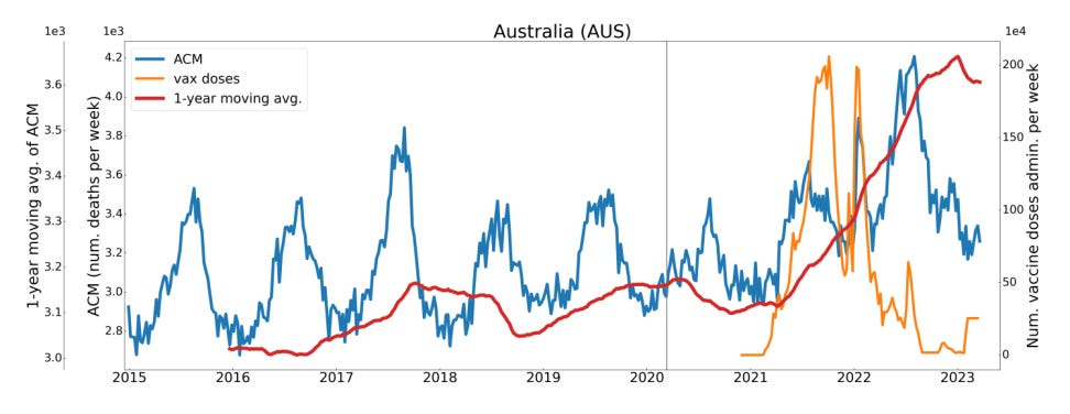
BONUS Graph 4. Denis Rancourt’s graph superimposed with Australia’s vaccination rates through to March, 2023.
If anyone wants my unedited line graphs they are available in the following PDF, please cite me if you choose to employ them. They took me 10 hours of laborious data transfer to create. Please email me if you would like the Word document with complete data tables.
Written in memorial of my grandmother, Lorna Baker, 94, now an excess death statistic for 12 February, 2022. See you in heaven, Nanna, hopefully after reaching my ton (100) which was stolen from you.
Provisional Mortality Data, 1 January 2015 - 31 December 2022 [Spreadsheet Download] and 2023 January-March [Original Graph: Spreadsheet Download]; [Updated Graph: Spreadsheet Download]
Sorry to hear about your grandmother. This must never happen again. There must be a reckoning.
I'm sorry about your grandmother. My work is to avenge my mother (aged 90), died in September 2021 after her 2nd Astrazeneca.
You've got a lot of stuff in this.
There an identical spike in ischaemic heart deaths in Victoria, timed immaculately with the covid deaths. I went to the coroners to see how many in the Aged Care homes died of non-covid causes. At St Basils there were 50 deaths, 5 non-covid. But during that lockdown, with massive numbers of staff furloughed, low value care, no visitors - it would've been a harrowing time in a number of nursing homes.